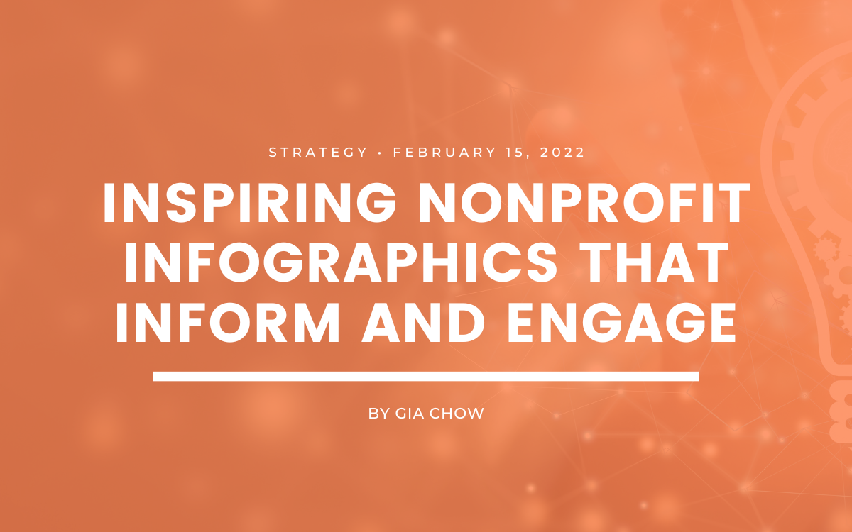
5 Inspiring Nonprofit Infographics That Engage Supporters

by Gia Chow | | Strategy | 0 comments
3 min to read ✭
Infographics have been trending in popularity these past few years and it’s no wonder since 65 percent of the population are visual learners. They are a powerful tool for nonprofits to engage supporters by conveying complex information in an engaging and visually appealing way. Here are some ways that nonprofits can use infographics to engage their supporters:
- Show impact: Nonprofits can use infographics to visually showcase the impact of their work. For example, an infographic could show the number of people helped or the amount of money raised in a fundraising campaign.
- Educate supporters: Nonprofits can use infographics to educate their supporters on complex issues related to their cause. For example, an infographic could explain the causes and effects of climate change or the importance of voting rights.
- Share data and statistics: Infographics can be used to share data and statistics related to a nonprofit’s work. For example, an infographic could show the number of children living in poverty in a particular region or the percentage of donations that go directly to the cause.
- Social media sharing: Infographics are highly shareable on social media platforms, making them an effective way to spread awareness about a nonprofit’s work. Nonprofits can create infographics specifically for social media, with the goal of engaging their followers and encouraging them to share the content.
- Engage donors: Nonprofits can use infographics to engage donors by showing them the impact of their donations. For example, an infographic could show the number of meals provided or the number of people who received healthcare services thanks to the donor’s contribution.
Below, we’ve rounded up five examples of the best nonprofit infographics to show you how you can use graphics to engage your supporters!
Zero Breast Cancer
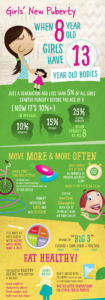
Puberty can be tough and more girls are hitting puberty earlier than ever before. In fact, just a generation ago, less than 5% of all girls started puberty before the age of 8. Now, this figure has jumped to over 10%. As a means to inform and educate, this infographic was created for Zero Breast Cancer’s Girls’ New Puberty campaign to promote health and wellness in girls before and during puberty. With eye-catching colors and playful fonts, this visual offers easy tips for young girls on how they can support healthy puberty.
Love Justice International
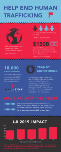
As an organization dedicated to stopping human trafficking, Love Justice International’s infographic attracts the audience’s attention by introducing three impactful human trafficking stats. It then goes onto briefly explain what the organization is doing and how someone can help. What’s great about this nonprofit infographic is that it’s not only educational but it demonstrates the organization’s success using a bar chart of the impact made as a result of collective efforts.
BRAC
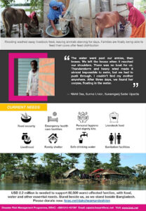
Working to address poverty by empowering people and communities, BRAC offers a host of services including disaster risk management. This particular nonprofit infographic focuses on the millions in northeastern Bangladesh impacted by one of the worst flash floods in 2022. To drive home a sense of urgency, this visual uses real-life photos and a testimonial from an individual affected by the floods. Calling for the viewer to stand beside them, this graphic highlights what the most pressing needs are and includes a link to donate.
Quality Start San Bernardino
 .
. 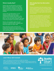
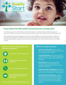
Quality Start San Bernardino’s infographic illustrates the importance of high-quality learning experiences for children, especially for those under the age of 5. Designed to inform, they explain what quality looks like and what their organization does to align with these standards, using photos and icons to break up the text. To conclude, they encourage the audience to learn more and get involved.
One More Wave
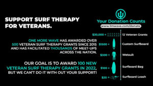
In contrast to our previous nonprofit infographic examples, this infographic from One More Wave is short, sweet, and simple. Even at a glance, there’s no mistaking the purpose of this graphic. Intended to encourage donations, they’ve included a visual that shows the tangible impact of a gift at each tier. In addition, they’ve highlighted the cumulative impact made since 2015, what their current goal is, and a call to action with a donation link.
Free Tools To Create Nonprofit Infographics
Here are some free tools that nonprofits can use to create infographics:
- Canva: Canva offers a free version of its graphic design platform that includes a wide range of templates and tools for creating infographics. While some premium features may require payment, nonprofits can still create high-quality infographics using the free version of Canva.
- Piktochart: Piktochart offers a free version of its platform that includes a limited selection of templates and tools for creating infographics. However, nonprofits can still create professional-looking graphics using the free version of Piktochart.
- Venngage: Venngage offers a limited free version of its tool that includes a selection of templates and customization options. While some advanced features may require payment, nonprofits can still create basic infographics using the free version of Venngage.
- Google Charts: Google Charts is a free tool that allows nonprofits to create interactive charts and graphs for their websites and social media. It offers a wide range of customization options and is easy to use.
- Infogram: Infogram offers a limited free version of its tool that includes a selection of templates and customization options. While some premium features may require payment, nonprofits can still create basic infographics using the free version of Infogram.
While these free tools offer a great starting point for nonprofits that want to create infographics without breaking the bank, it’s worth noting that they may come with some limitations, such as a limited selection of templates or watermarked graphics.
Now, I hope you have what you need to start creating infographics for your nonprofit to better engage with your supporters and tell your story!